

Tweaking colour is one of the most difficult aspects of the post-production workflow. Some photographers avoid it entirely and just go with what they are given by the camera and the software that they opt to use. The problem with this approach is that each software developer comes up with their own recipe in interpreting pixel data in a RAW file into colour information in a bitmap image. So basically, what you see is not what you get.
Lightroom is by and large the default app for arguably the majority of professional photographers out there. Yet, very few photographers actually know how to colour grade their images in this software, let alone in Adobe Camera RAW (ACR), which uses the same processing recipe. The furthest many photographers will venture is playing with the Camera Calibration and the White Balance Settings. These are important first steps, but we can do more.

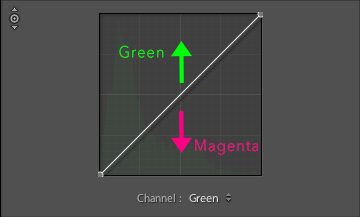
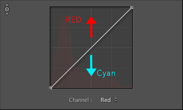
The secret to effectively colour-grading an image is to use the Tonal Curve control. In the bottom right hand corner of the Tone Curve control is a small square button with a curved line in it. Clicking on this changes the Tone Curve from a slider dialogue to a point curve. This means that we can directly set points on the curve line and adjust them. You will also notice that beneath the curve and the superimposed histogram is a drop down box that enables you to select the individual channels (to whit: full RGB, Red, Green or Blue).

The basic concept of the Curve Control is that if we create an anchor point on the curve line and pull it up, we will lighten those tones in the histogram. Pull down and we darken the tones. Contrast is essentially the difference between light and dark tones in an image. We can increase contrast by pulling down on curve line in the shadow section of the histogram and pushing up on the lights section of the histogram (there is a full explanation of this on the blog). The examples overleaf should give an idea as the tonal control possible.


 When working on an image the photographer can assess the highlights and the shadows of the image and tweak the colour accordingly. So in the example image of a patio lit by artificial light I am going to warm up the shadows and remove some green caste from the lighting while cooling down the blue sky so that it contrasts more effectively against the warm walls. The image on the left is the retouched picture, while that on the right does not have colour adjustments.
 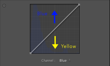 Looking carefully at the resultant curves you can see that I did more than simply pull or push the curve in each of the channels. In the red channel for example, I have targeted the lights to highlights of the image. I placed two anchor points in a line to lock the curve and then tweaked with a third anchor point by pulling down on the red channel to bring out some cyan on the highlights. I have done a similar action to the green channel to remove a green caste from the glow of the lamps.
Another neat trick is the use of the Targeted Adjustment Tool (top left corner of the Tone Curve box). You can use this to click on the image and select the actual you want to work with. When you click on the image it creates an anchor point. Staying on the image you can push or pull that tone by dragging the cursor up or down.
The beauty of working in Lightroom is of course that these adjustments can be synced across to similarly lit images. You can copy the changes to the image by hitting Shift+Cmd+C/Shift+Cntrl+C and then only selecting the tone curve control. Go to the next image and paste these changes by hitting Shift+Cmd+V/Shift+Cntrl+V. An even easier way is to first select the ‘master image’ (i.e. the one you have just worked on) and then select the additional images you want to colour correct (hold down Cmd/Cntrl while clicking on the additional images or hold shift and click on the last image in the sequence). Once the images are selected look to the bottom of the right hand palette and hit the sync button in Develop mode or the sync settings button in the Library mode. The same box appears with all the possible changes that you would have seen if you had copied settings. Select just the Tone Curve and click the Synchronise button. It’s that simple.
Learning how to use the Tone Curve in colour correcting images can dramatically speed up your workflow. The trick is to use small changes rather than broad sweeping ones.
No comments:
Post a Comment